


.png)

Read all about the rebrand process that took us from Pharmacist Phil to joyful simplicity.
MedAdvisor was founded by Josh Swinnerton in 2012, the year of the Hunger Games, Instagram, Gangnam Style.

As a small company it’s natural that the brand is an expression of the personalities of its people. Our founding team are grounded, hard-working, curious and passionate people. So that’s what MedAdvisor was, and what it is still is at heart: Grounded. Curious. Passionate.
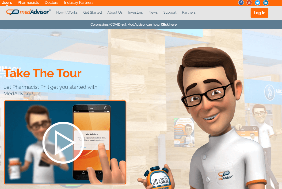
But our old branding didn’t reflect any of that. Take a look:
As companies evolve, their branding should evolve with them.
MedAdvisor isn’t a small company anymore. When we began our rebranding efforts MedAdvisor was installed in over 60% of Australian pharmacies, the app had been downloaded more than a million times and we had business operations in Asia, US and the UK.
It was long overdue for a fresh look.
Before diving into logos, colours, icons and fonts, we had to do some thinking about who we are now and where we want to go.
We needed to define our core identity, the brand personality and values that will remain constant as MedAdvisor grows. This core identity is the heart of our brand and informs everything we do.
With the MedAdvisor rebrand, we wanted to make sure that the brand personality and values were things that really defined us, as individuals and as a company.
One thing that struck me when I joined MedAdvisor, and what makes it a great place to work, is that everyone here really cares. MedAdvisor people truly believe in the company and feel a strong sense of responsibility for its success.
Rebranding can be a scary and uncertain time for any company. And at MedAdvisor, with so many dedicated stakeholders, getting the rebranding right wasn’t just an important business decision, it was a personal one.
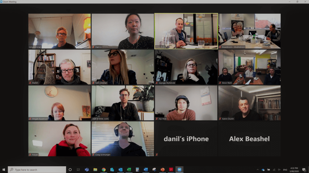
That’s why we were careful to involve key MedAdvisor stakeholders in the process of defining our core identity. We wanted to know what MedAdvisor meant to the individuals who know and love it best, so we could help the brand grow into a better version of itself. So, we gathered as a virtual group, with participants dialing in from Melbourne, Sydney and New Zealand, for a full day of Zoom deep-diving into the MedAdvisor legacy and vision.
Company values can often feel like generic, “motherhood” statements that only exist in employee training documents or inspirational posters.
At MedAdvisor, we wanted our values to really influence everything we do, as individuals and as a company.
We’ve got six of them:If our values are the mottos that we strive to live by, then our brand personality is the traits that we’d like to be known for.
In the brand workshop we discussed
From the list of ‘traits’ that were uncovered it was clear that for MedAdvisor there are multiple personalities, some negative and some positive. The overriding positive traits show the true back bone of MedAdvisor.
‘At MedAdvisor we are about helping people achieve better health outcomes.’
After many, many rounds of revisions, we finally nailed down the five brand personality traits that we felt best described MedAdvisor and our vision for the future. We determined that MedAdvisor is:
To build a loyal customer base you need to provide a great experience every single time people interact with your brand. A consistent voice and tone across all the touchpoints between us and our audience can help us do that. Not only will it make our brand sound more human, but it will also make it more likely that our audience is able to connect with us on a more personal, emotional level.
Establishing voice and tone guidelines can help us ensure that the way you communicate with people is always as unique as the services you provide. It gives our brand a personality that’s easily recognizable to your audience.
Based on the feedback we got (and after hours of deliberation), we settled on four brand voice attributes that we felt fit our company’s personality:
As you may have noticed, there’s crossover between our brand values, personality, and voice. It should be this way, as this means consistency, cohesion and ultimately a stronger brand image.
Once the core identity was defined, it was time to look at bringing it to life. This is where Aaron’s genius came in.
The current MedAdvisor logo was complicated. It had lowercase and upper case and 3 different colours and gradients. There was a lot going on... and it didn’t work very well in black or white... or at a small size.
Aaron created three strong options, one that was heartfelt, but was widely used, one that was very corporate and one... that was just... “us”.
The new logo brings forward our heritage and the loyalty our customers have to our existing brand into the modern age. The logo truly reflects the joyful simplicity of our brand. The outcome is a friendlier, more approachable logo that captures our personality, while remaining recognizable to our existing customers.
It’s a better version of ourselves.
Royal Blue: is a favorite color for companies that wish to convey reliability, trustworthiness, and communication (think Facebook, Twitter, and Samsung) and for expressing the authority of organizations like the police. Our royal blue expresses professionalism, dependability, and strength while the vibrancy of the blue is contemporary.
Dusk Red: is a bold, energetic, and lively color that can symbolize strength, confidence, and power. In many Asian countries such as India and China, red is regarded as the color of happiness, wellbeing, and good fortune.
Sky Blue: One of earth’s most beautiful colours, it imparts joy, hope, and reflection on the awesome beauty that surrounds us
Logo Font: Mont
Mont is a geometric sans serif. The balanced characteristic of Mont with unique details, such as the pointed “t” and the prominent x-height makes it perfect for strong headlines and outstanding logos, but also suitable for long text.
The typefaceʼs versatility and merits make it easy to confront any graphic design challenge — web, print, motion graphics etc.
Poppins is an open-source free font and is one of the newcomers to geometric sans serif typefaces. With support for the Devanagari and Latin writing systems, it is an internationalist take on the genre.
Each letterform is nearly monolinear, with optical corrections applied to stroke joints where necessary to maintain an even typographic color. To contribute, see github.com/itfoundry/poppins
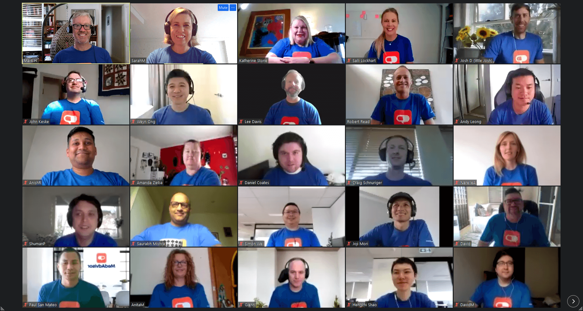
Our team is working to apply the new identity across the entire business as quickly as possible, but you may see our old and new brand in use at the same time.
So far, we’ve updated our website, social media profiles and email communication. The app and other touchpoints are in progress and will fit the new brand style soon.
Don’t worry if you see our old logo and branding - know that we’re working on it.
We are still your reliable partner and we’re here for you.

.png)
No Comments Yet
Let us know what you think